01 / Project Background
Project Background
Laguna Ocean Foundation partnered with our UC Irvine capstone team to redesign their existing educational website focused on Laguna Beach tidepools. The organization centers around environmental education, conservation awareness, and helping visitors safely explore marine ecosystems.
The existing site contained useful information, but the experience felt unfinished, difficult to navigate, and inconsistent across devices. Important content such as species information, tidepool locations, and tide schedules was either hard to locate or lacked visual engagement.
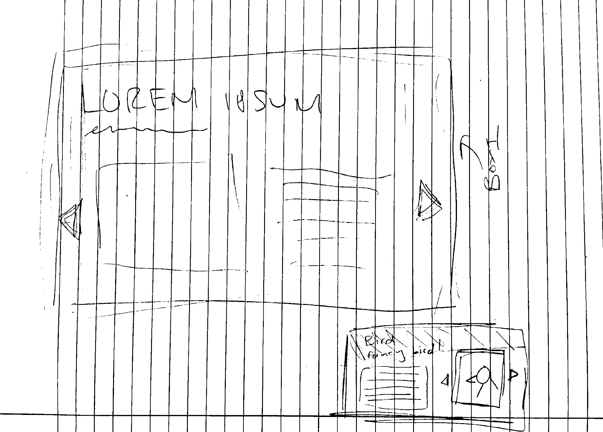
Original site screens referenced in the project documentation.
Our team inherited both the previous codebase and existing project materials from an earlier capstone team. This meant balancing redesign work with understanding an already-established technical structure and adapting to evolving stakeholder feedback throughout development.
The redesign aimed to create a more engaging experience for educators, families, students, and visitors while improving usability across both desktop and mobile devices.
02 / The Problem
The original site struggled with clarity, usability, and engagement.
The species guide lacked visual hierarchy and mobile usability, making it difficult for users to quickly identify marine life while onsite at the beach. Information related to tidepool locations, live tide data, and FAQs was fragmented across the experience, while the desktop interface felt visually incomplete and inconsistent.
The sponsor also emphasized the need for the platform to feel more modern and educational without overwhelming users with excessive information.
Main usability issues
- Limited interactivity throughout the site
- Poor desktop optimization
- Difficult navigation flow
- Inconsistent visual design
- Limited discoverability of educational resources
- Non-responsive layouts in several areas
- Lack of embedded live tide information
Beyond aesthetics, the challenge was to redesign the platform in a way that better supported real visitor behaviors, whether someone was planning a trip in advance or actively exploring the tidepools onsite.
03 / Users & Research
Understanding who the site needed to serve
Through stakeholder discussions and persona development, we identified several core audiences: families planning beach trips, educators organizing student activities, students researching marine ecosystems, nature enthusiasts visiting the tidepools, and children exploring marine life interactively.
Sarah - The Planner
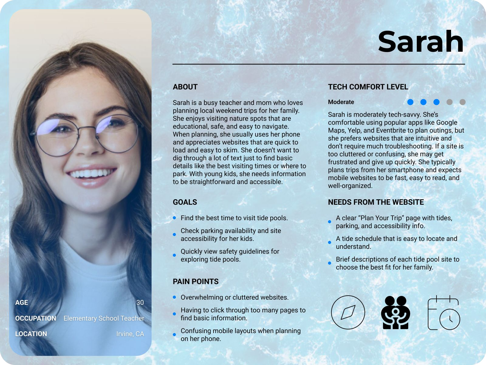
Sarah is an elementary school teacher planning a tidepool trip for her students. She needs clear navigation, safety information, tide schedules, and educational material that can be easily shared with children.
James - The Explorer
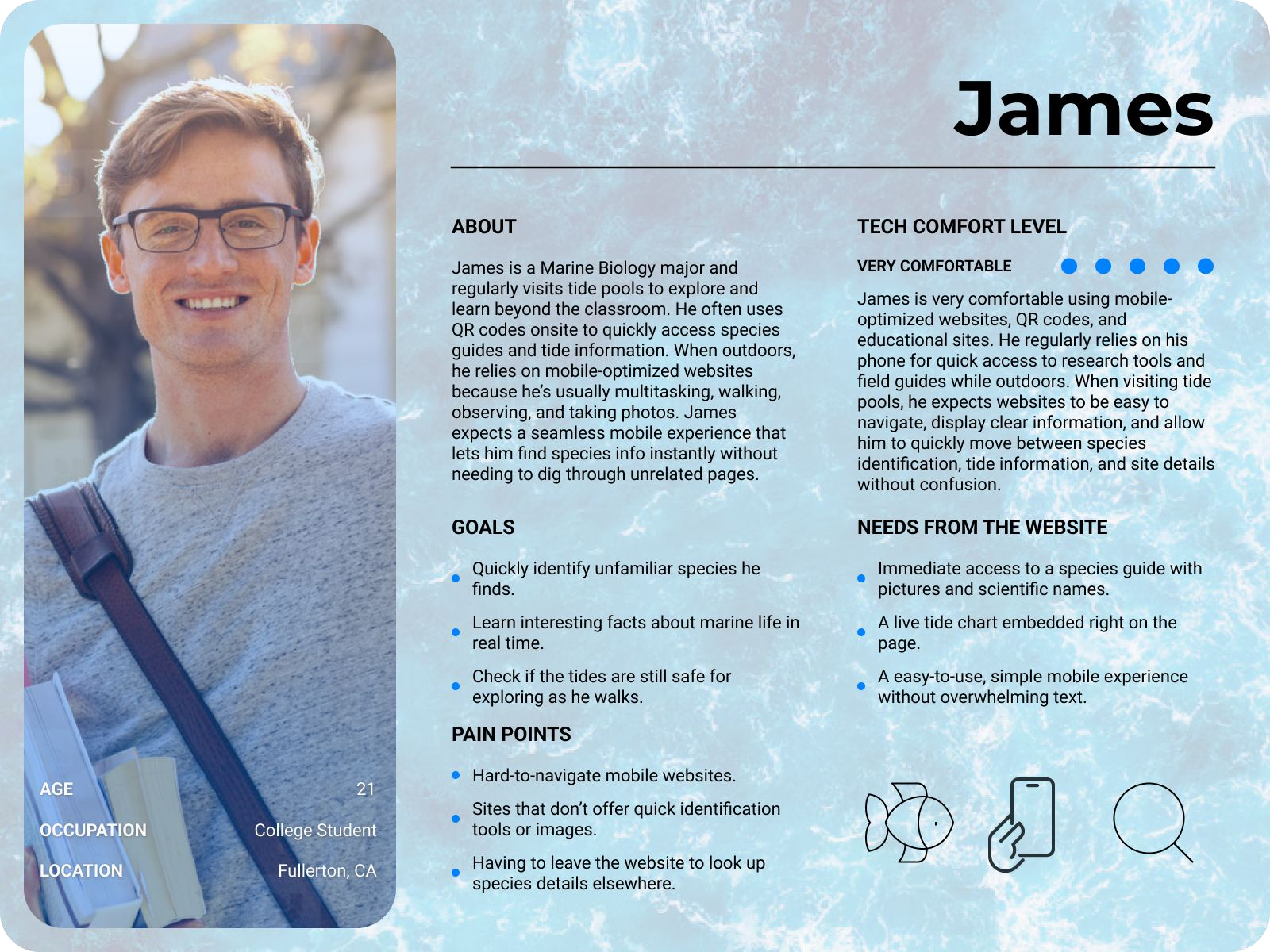
James is a marine biology student already onsite at the beach. He wants to quickly identify species using his phone while actively exploring the tidepools.
Lily - The Child User
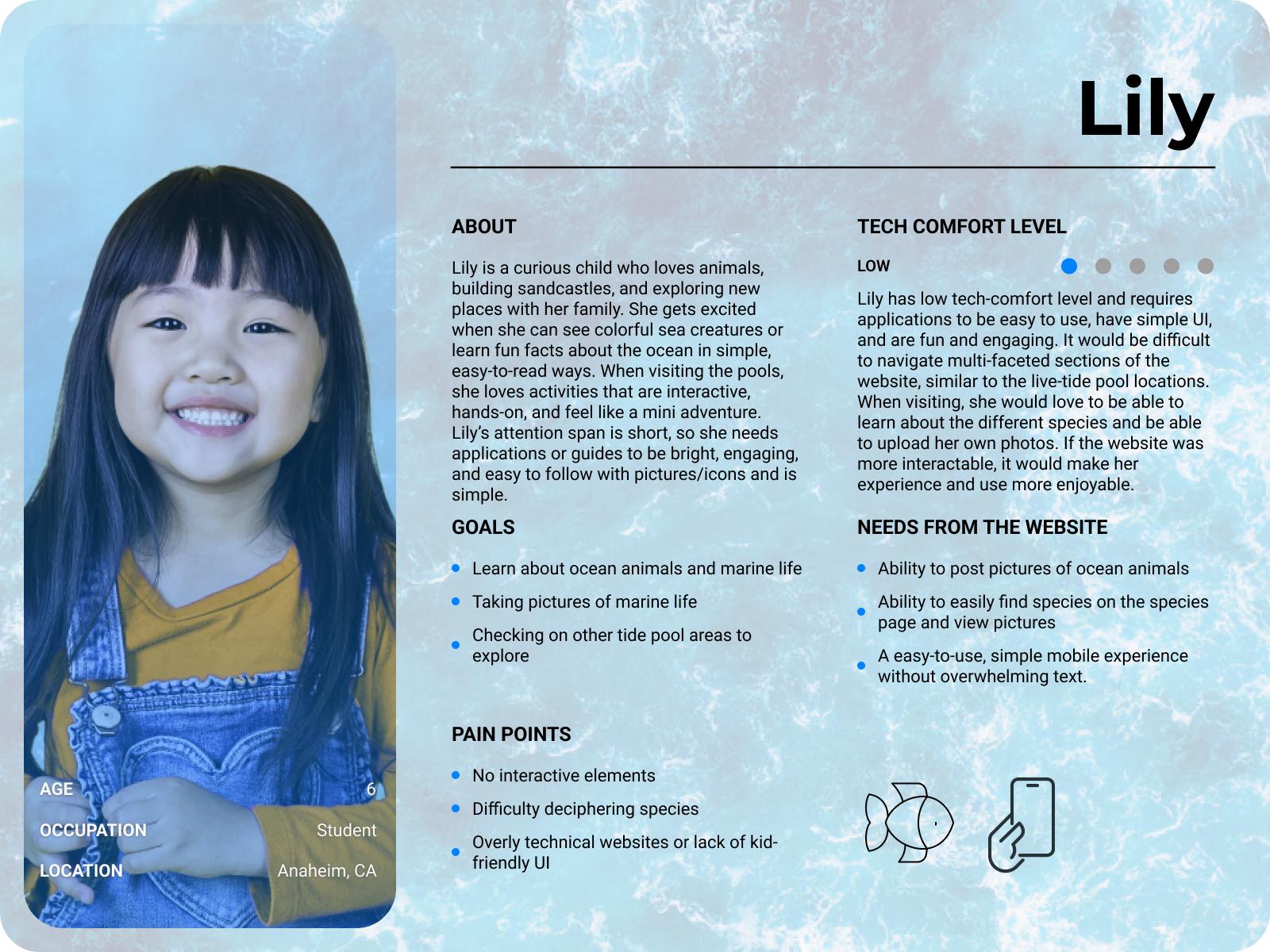
Lily is a younger visitor interested in discovering marine life through visuals and interactive exploration. Her experience emphasized simplicity, readability, and engagement.
A major insight from our research was that users arrived with very different goals depending on context. Some users needed trip-planning tools before arriving, while others needed fast access to species information in real time at the beach. This became the foundation for restructuring the site's navigation and user flow.
04 / Requirements
Turning stakeholder priorities into design direction
After meeting with stakeholders and reviewing previous project documentation, our team established a set of prioritized functional requirements that guided the redesign.
Critical features
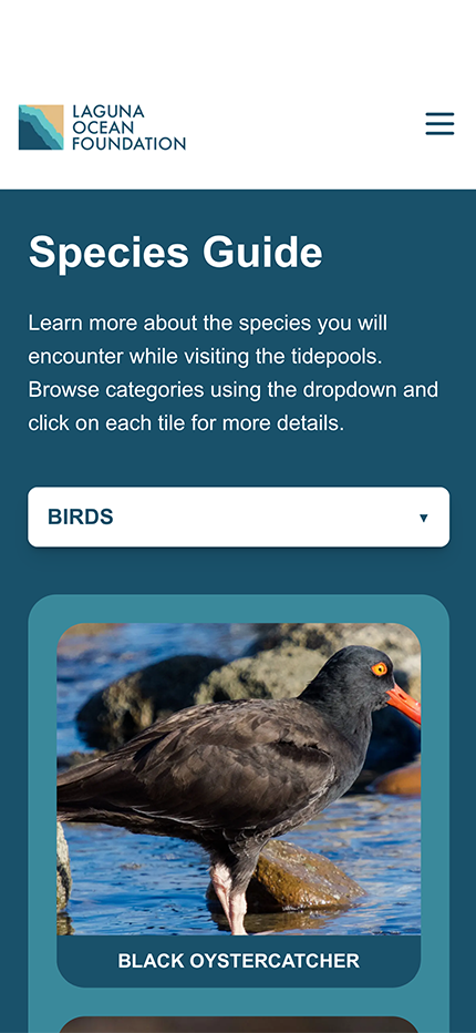
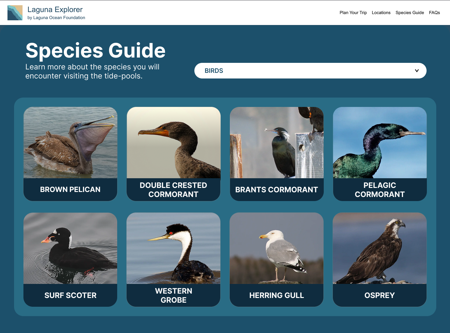
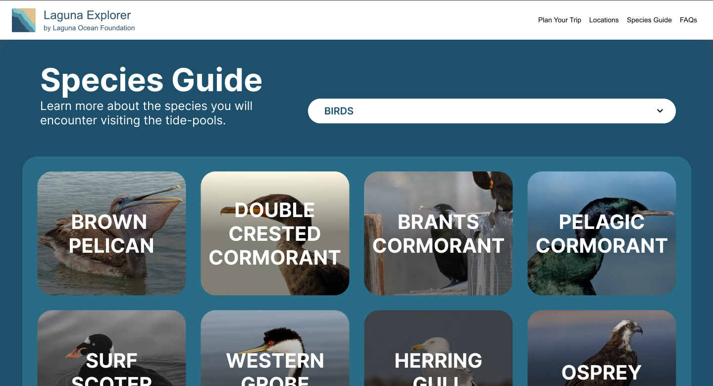
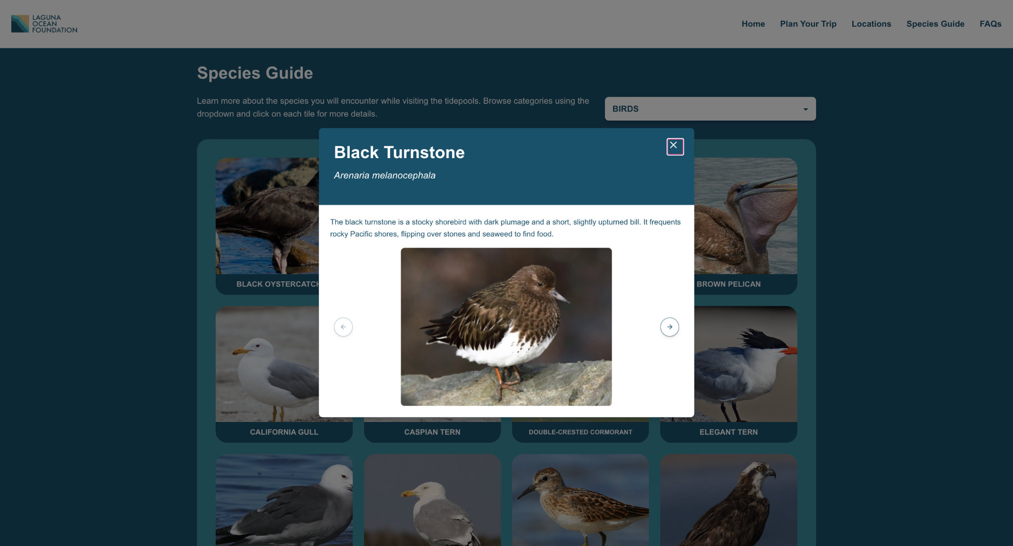
- Interactive species guide with expandable species information
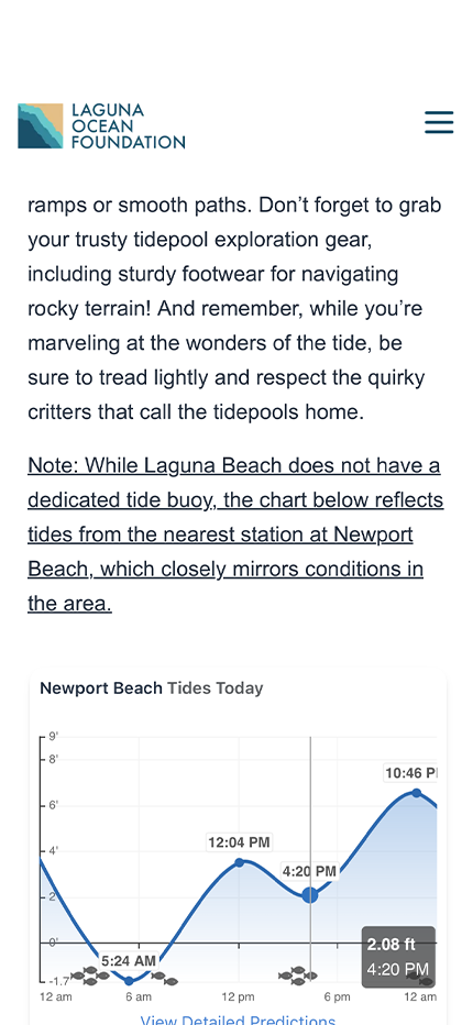
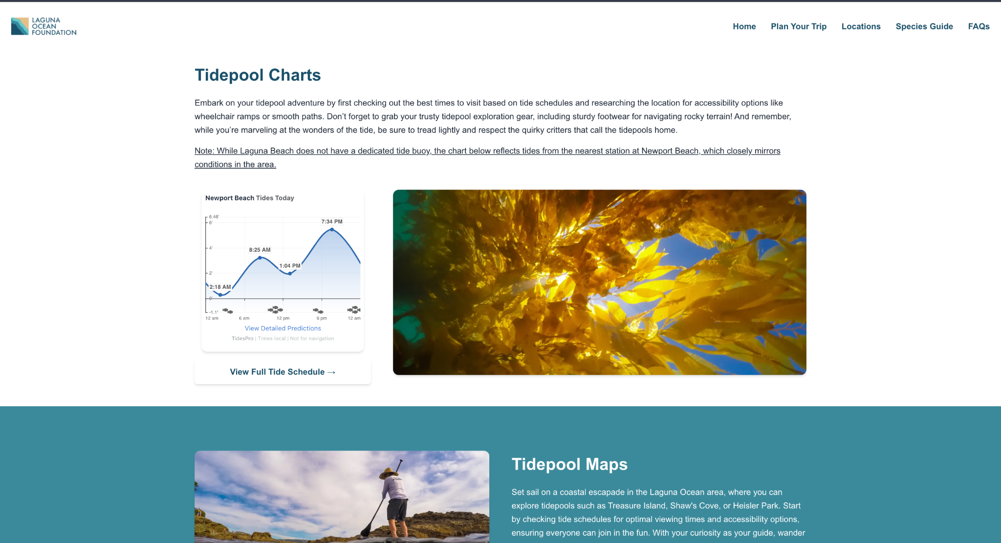
- Embedded live tidepool data directly on the website
- Fully responsive mobile and desktop layouts
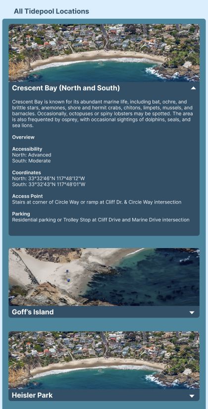
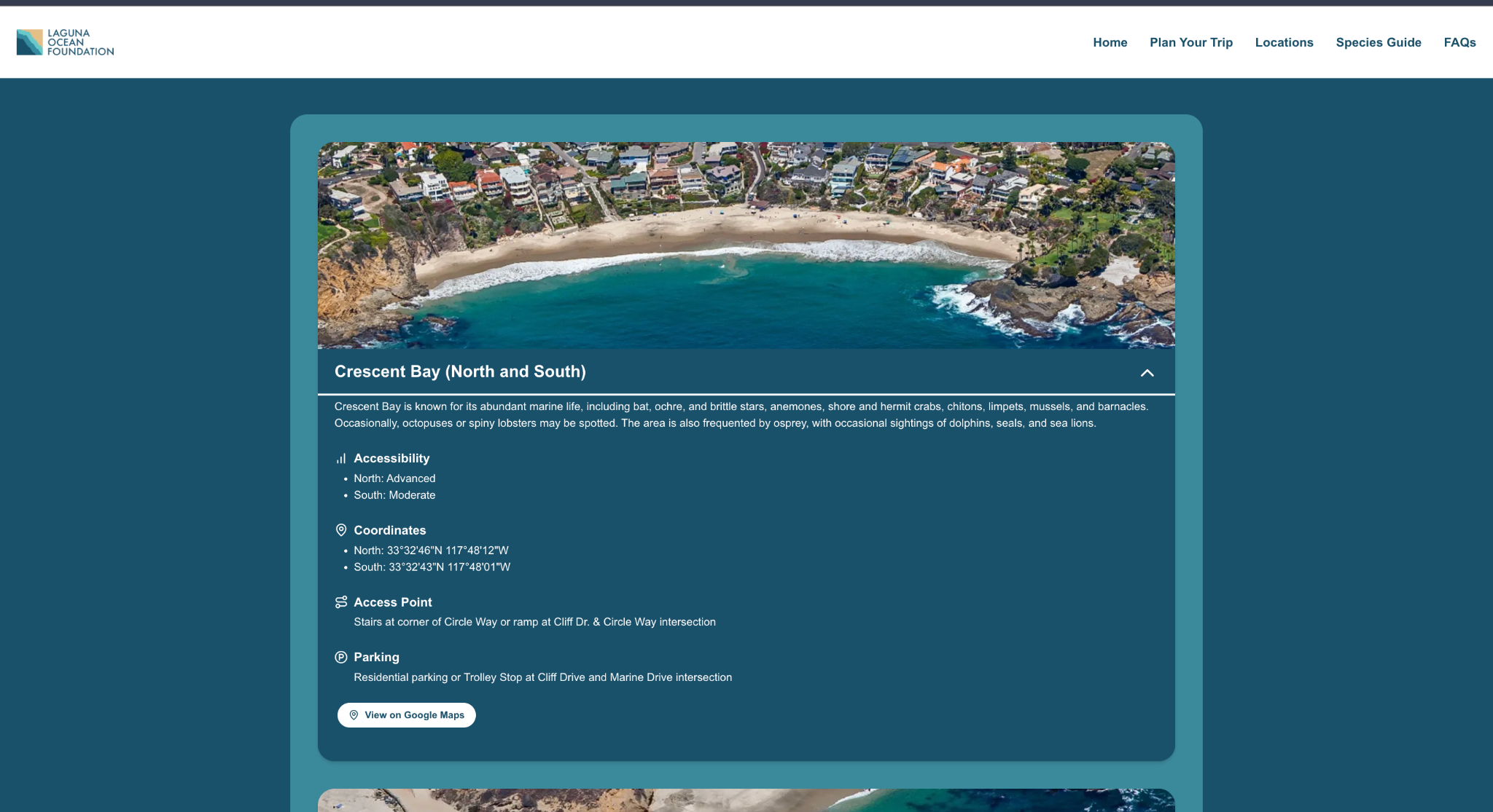
- Clickable tidepool locations with access details
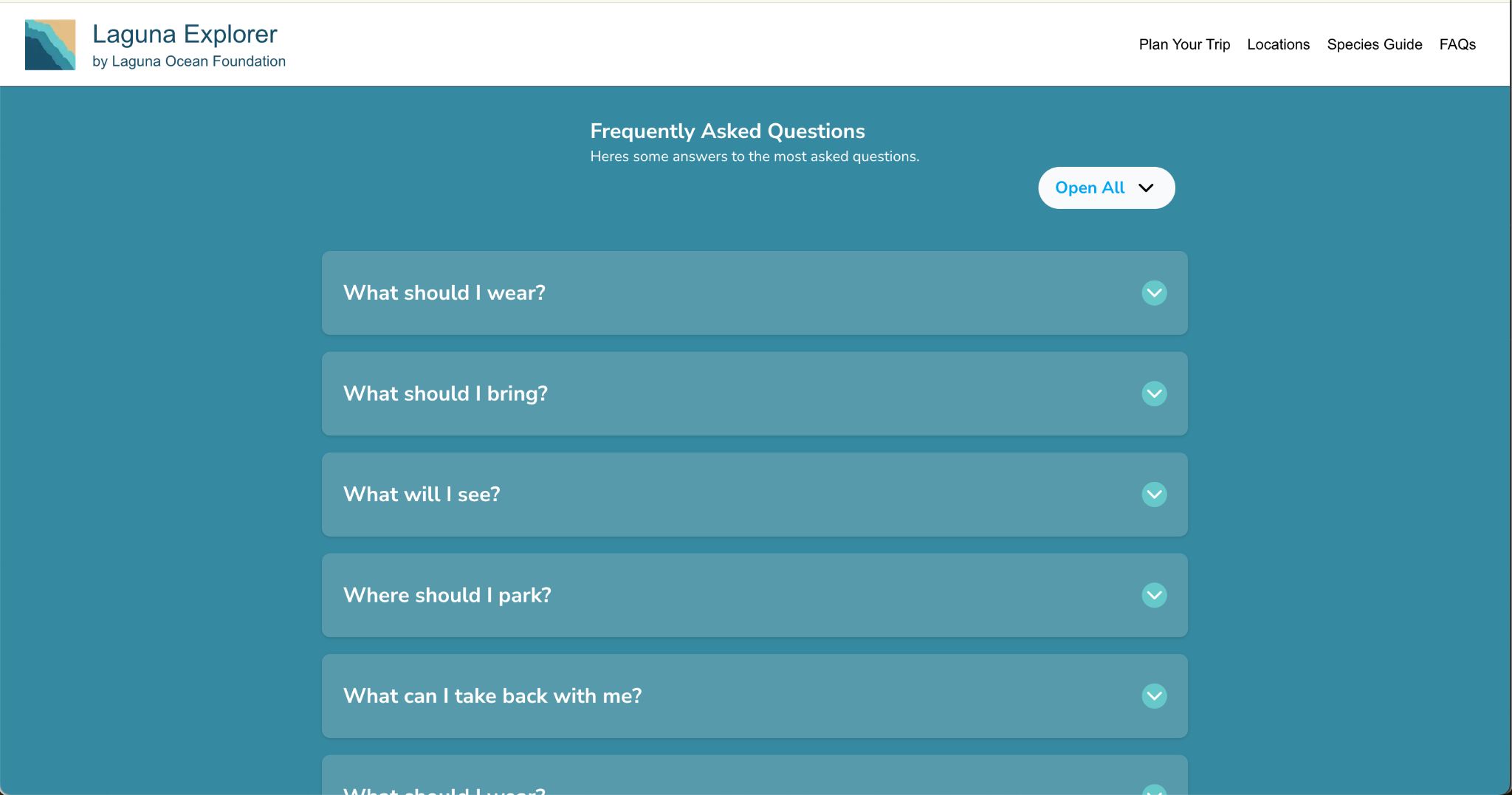
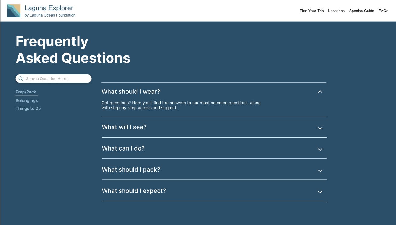
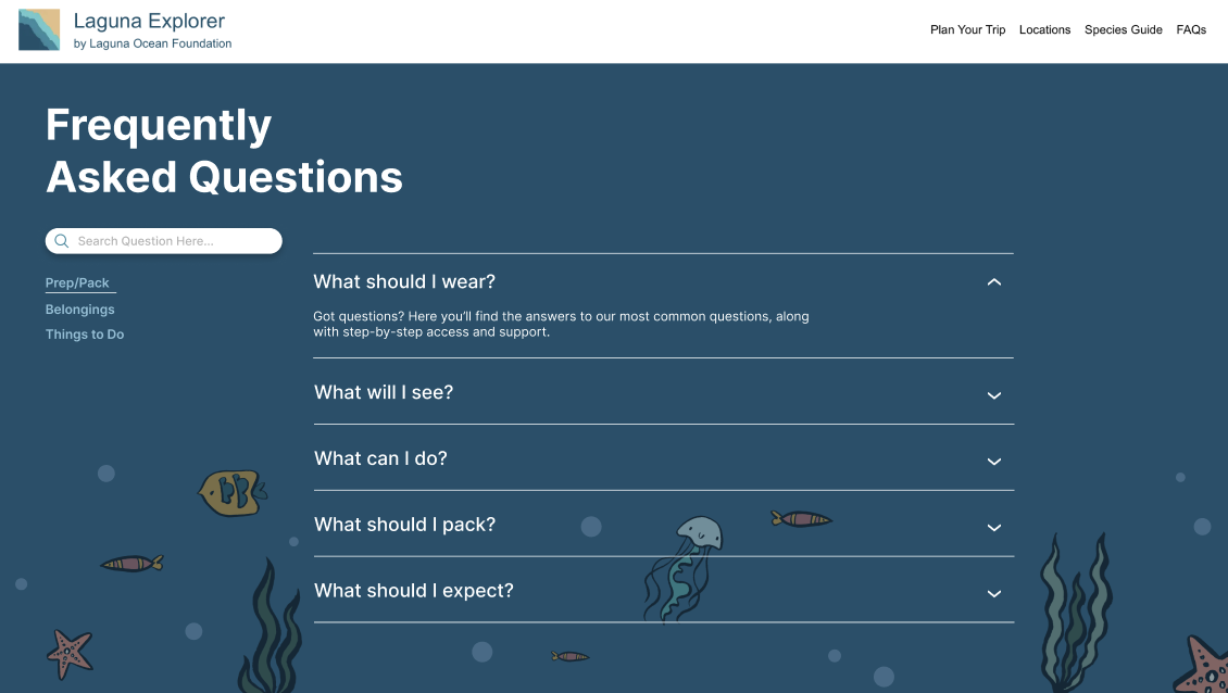
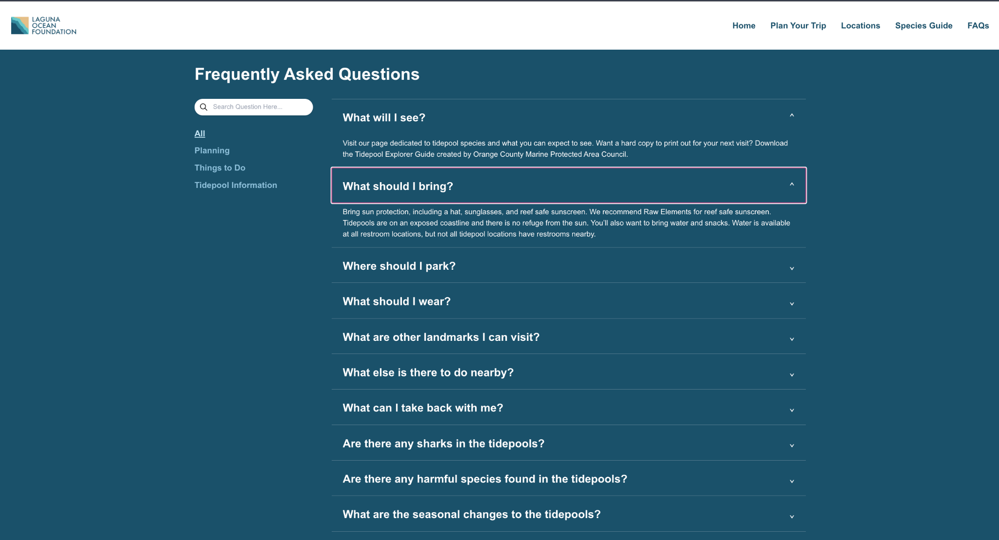
- Expanded FAQ content
- Improved visual consistency
- Alphabetized species organization for easier browsing
Non-functional goals
- Simple and non-overwhelming information architecture
- Fast-loading pages despite image-heavy content
- Accessibility across devices
- Maintainability for future Laguna Ocean Foundation updates
- Reliable long-term deployment and uptime
Rather than redesigning purely for visual polish, the project centered around solving concrete usability and accessibility issues identified through stakeholder feedback and user needs.
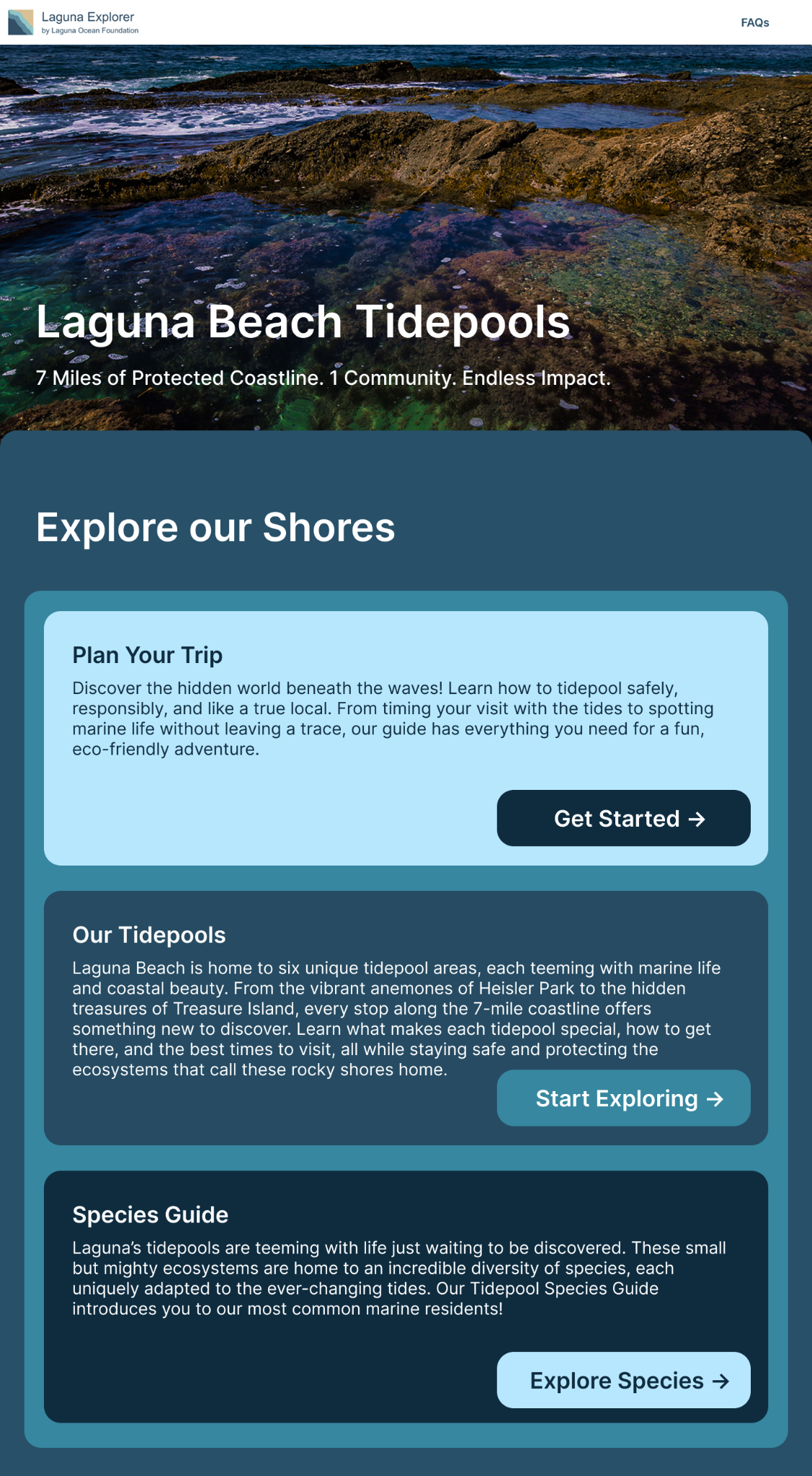
05 / User Flow
Separating planning from exploration
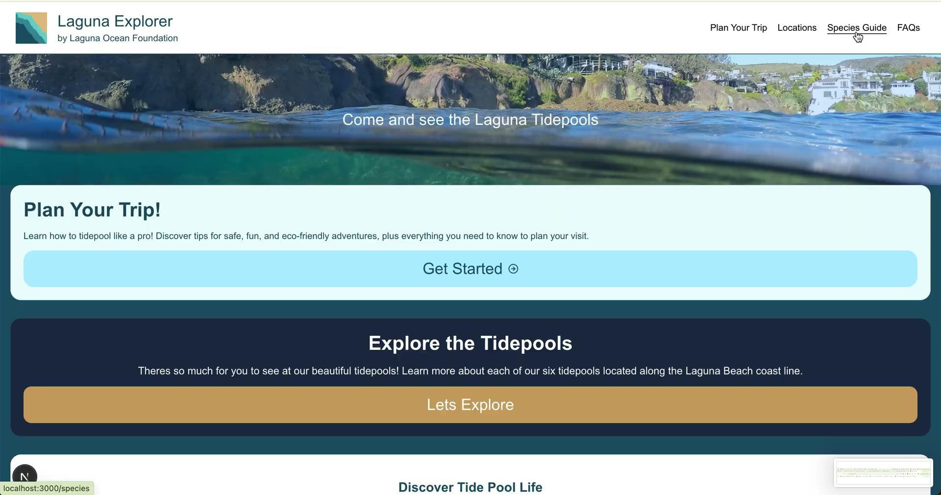
One of the biggest structural changes in the redesign was simplifying the website's navigation into two primary pathways based on user intent.
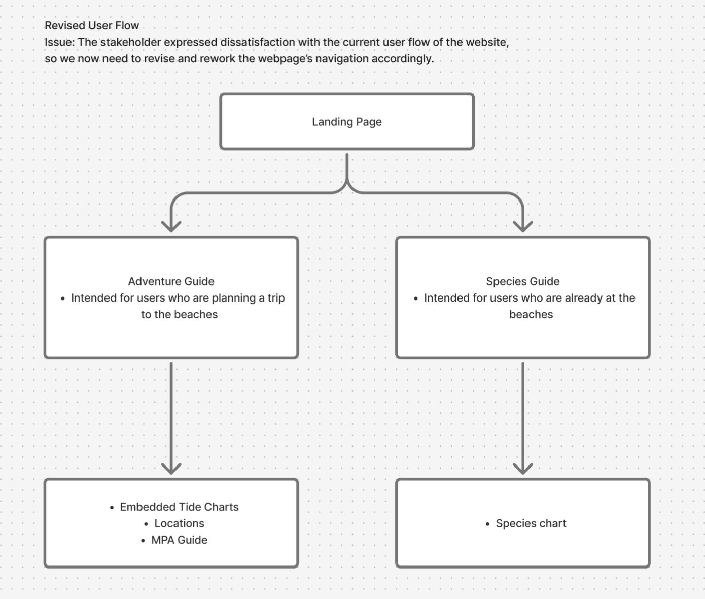
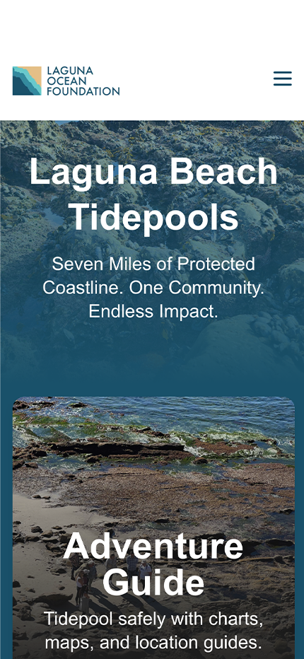
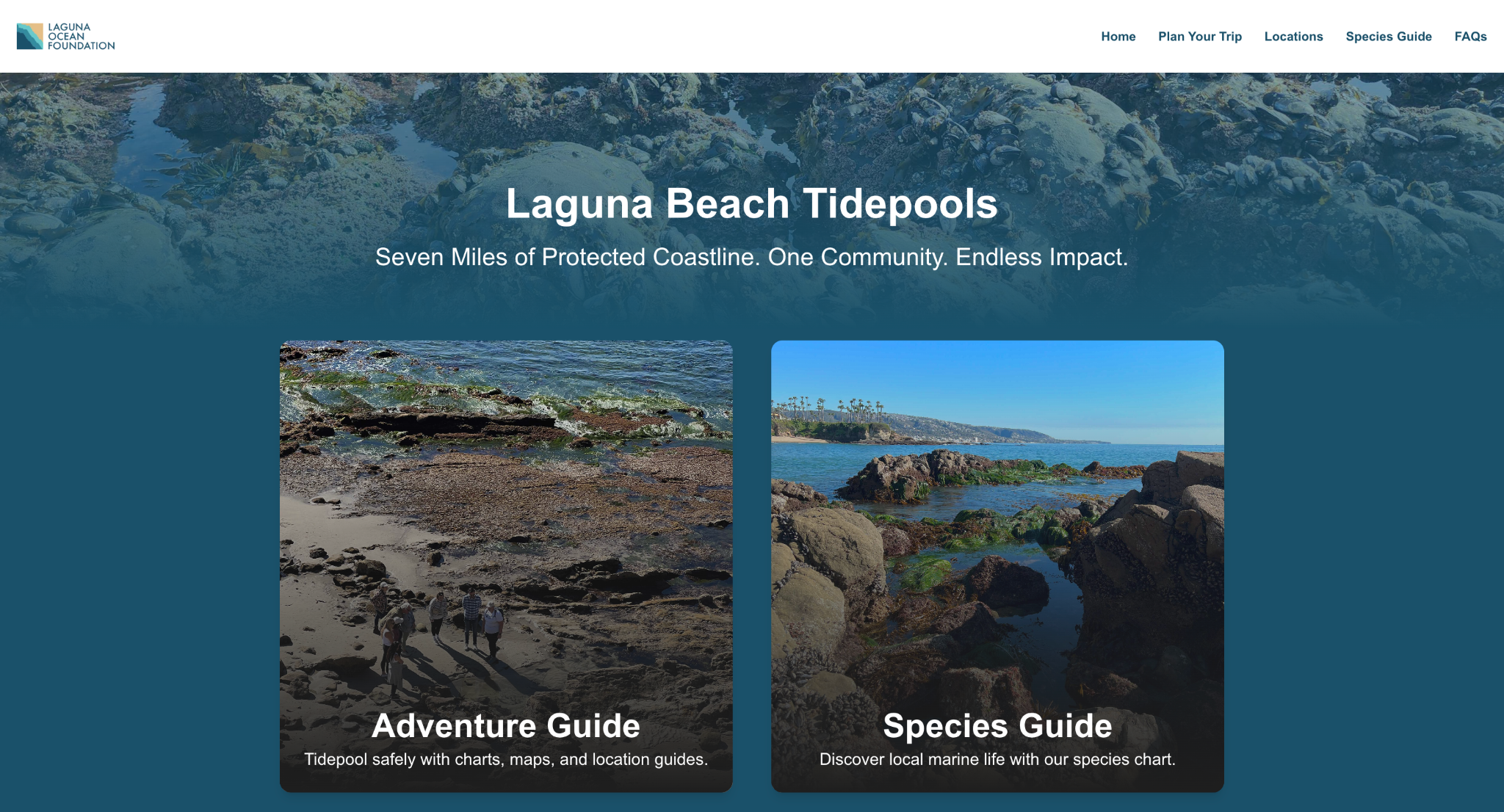
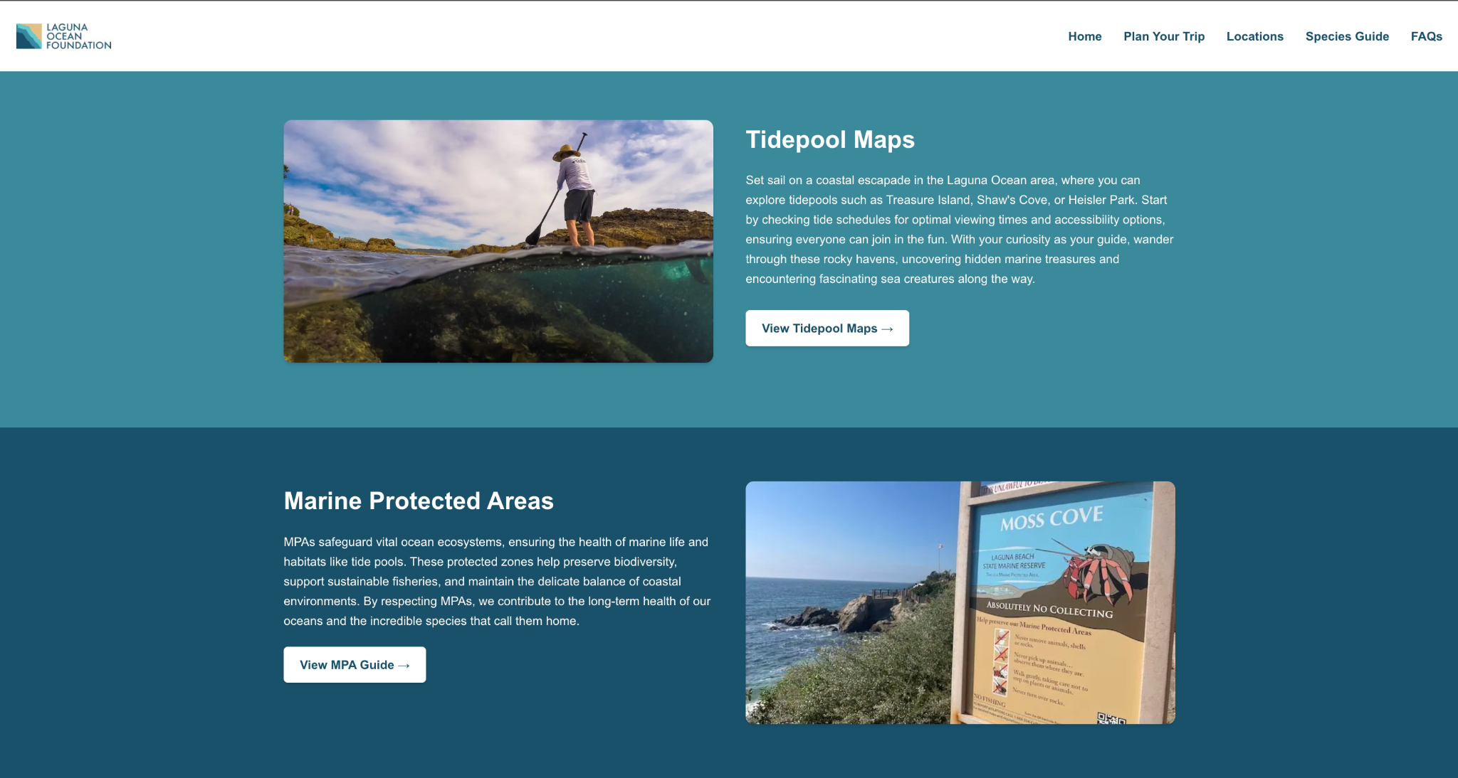
Adventure Guide
For users planning a trip.
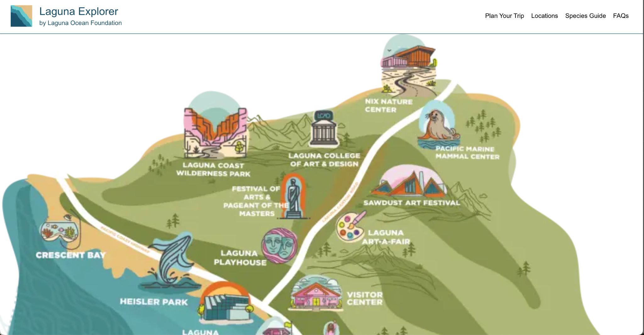
- Tidepool maps
- Live tide schedules
- Marine Protected Area information
- Trip preparation resources
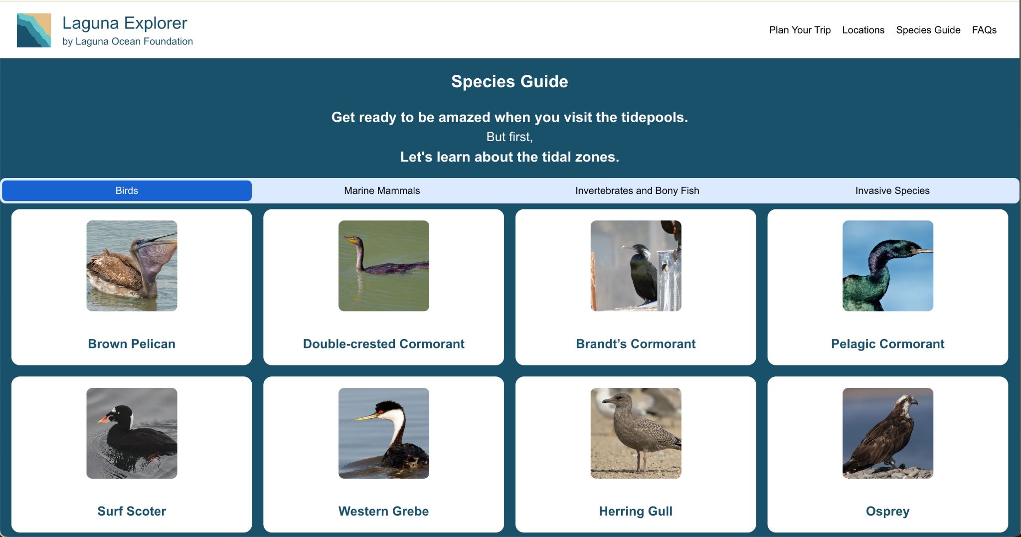
Species Guide
For users already exploring onsite.
- Marine life identification
- Expandable species cards
- Visual learning
- Faster mobile interaction
Separating these flows created a clearer mental model for users and reduced the amount of information competing for attention at once. The updated flow also became the foundation for our personas, wireframes, and final interface decisions.
06 / Design Exploration
Iterating through layout, navigation, and visual direction
The design process evolved heavily throughout the project due to iterative sponsor feedback and changing visual direction. Our team explored multiple homepage layouts, FAQ structures, species guide interfaces, and navigation systems before arriving at the final experience.
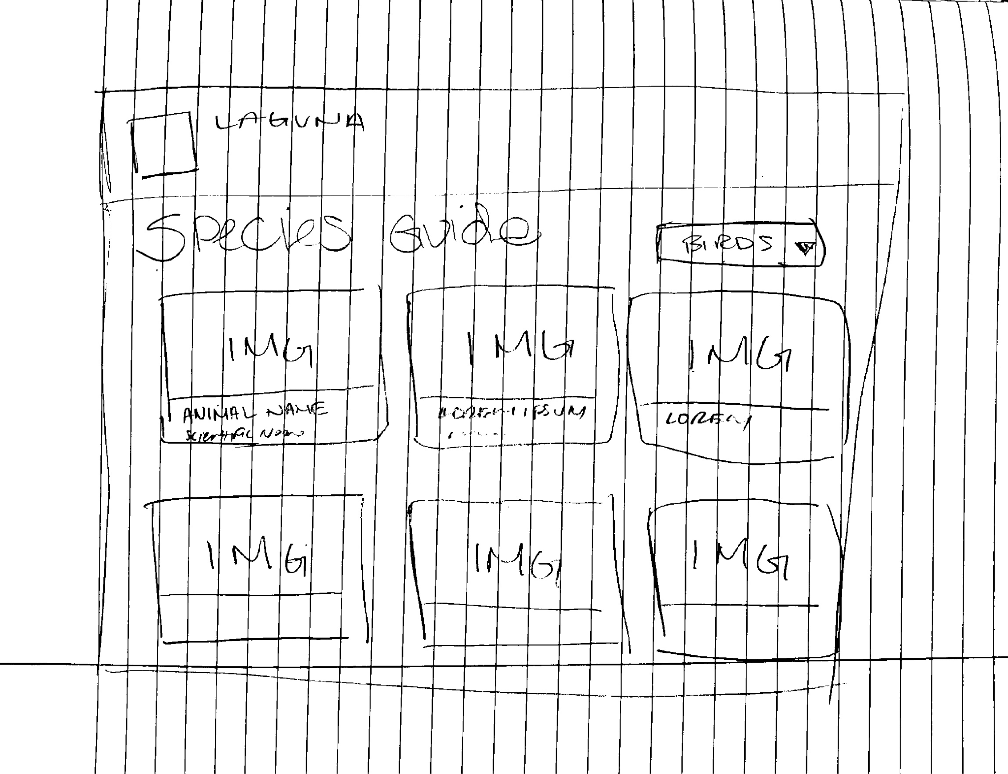
Low-fidelity species guide wireframes
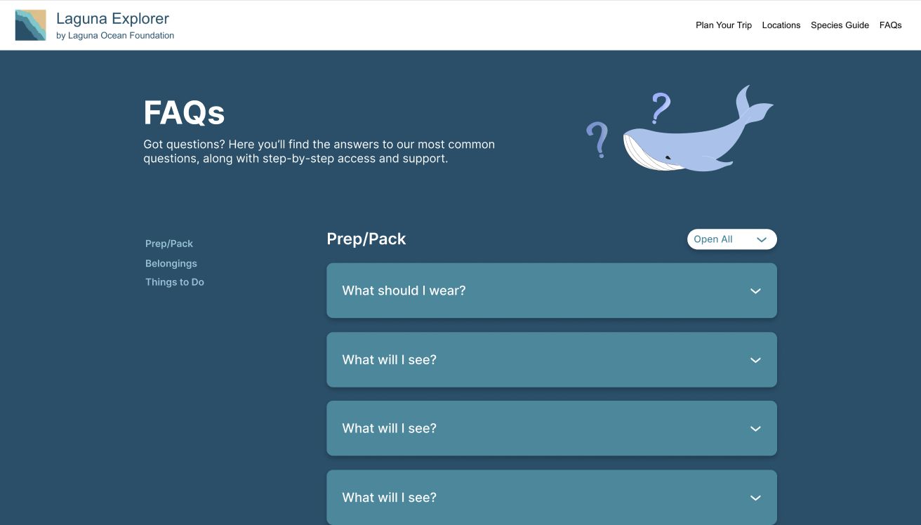
Alternate FAQ layouts
Homepage redesign drafts
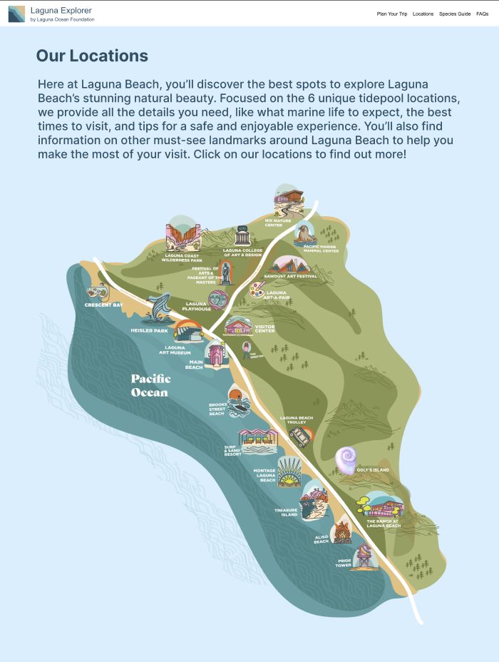
Interactive map concepts
Plan Your Trip iterations
Species guide high-fidelity exploration
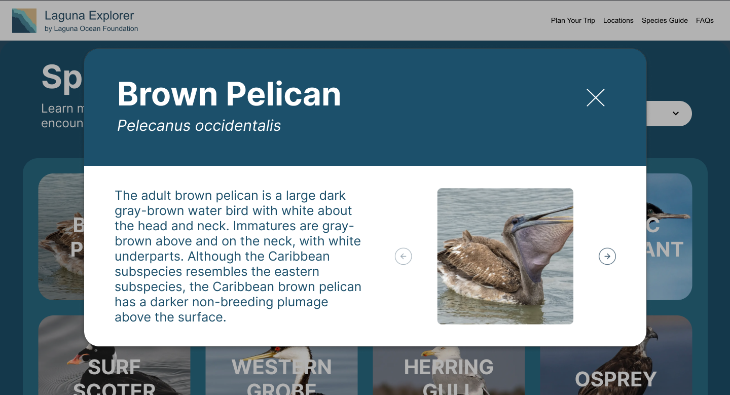
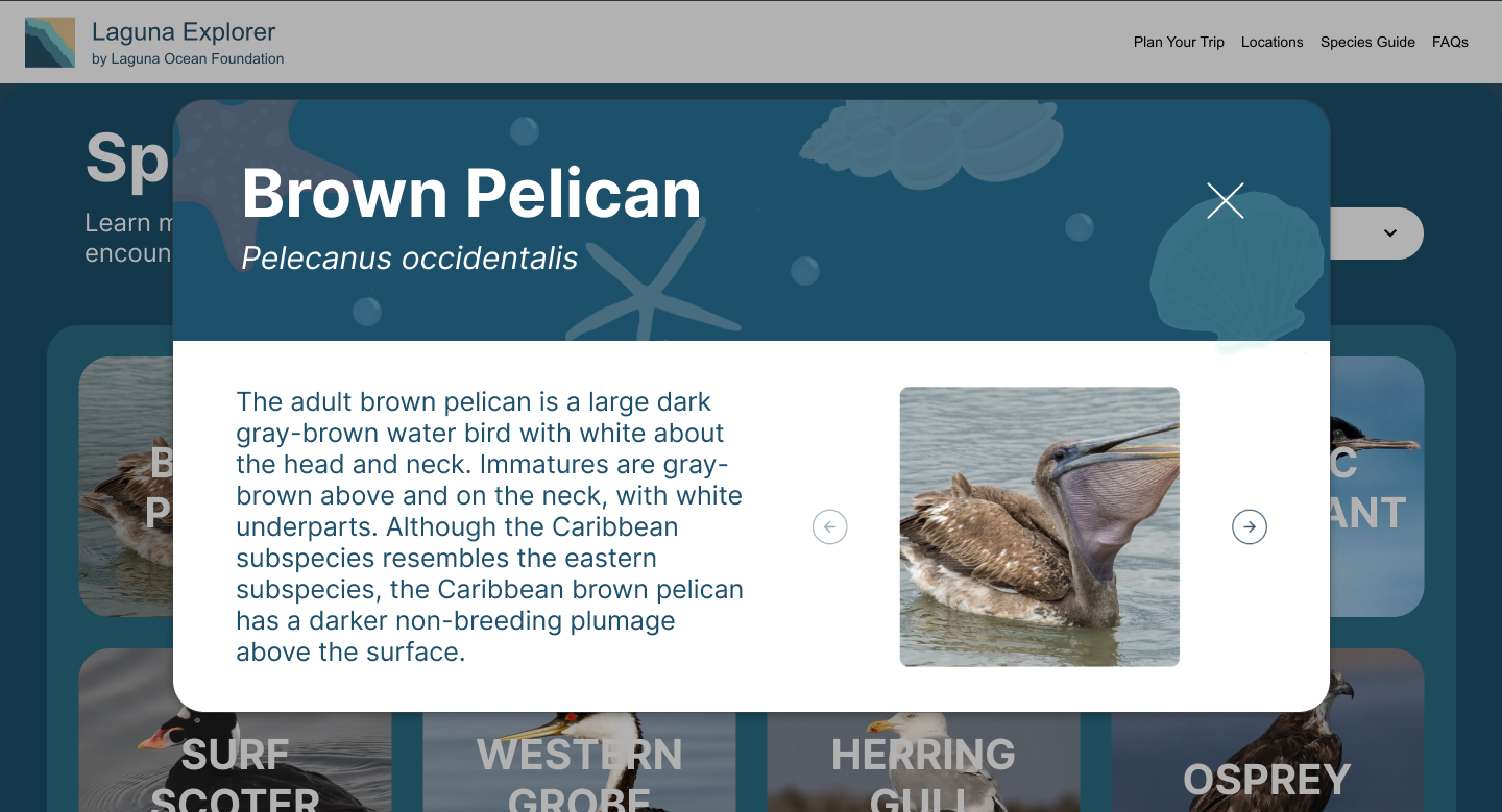
The species guide became one of the most heavily iterated portions of the site. We explored different organizational methods, popup interactions, dropdown systems, and visual layouts to improve usability without overwhelming users. Figma served as both a collaborative planning tool and a way to quickly iterate based on sponsor critique before implementation.
07 / Development
Translating Figma into a working site
A major portion of the project involved translating high-fidelity designs into a fully functional React and Next.js website.
Development work included
- Building responsive layouts for mobile and desktop
- Implementing interactive species cards
- Embedding live tidepool widgets directly into the site
- Creating expandable location information
- Improving accessibility and keyboard navigation
- Maintaining visual consistency across pages
One of the primary implementation focuses was the interactive species guide, including alphabetized organization, expandable popup cards, improved imagery, better mobile usability, and keyboard event handling for accessibility.
Because the project inherited an existing codebase, development also involved understanding prior architectural decisions while restructuring portions of the frontend to support the redesigned experience. The project ultimately became a strong balance between UX thinking and frontend execution.
08 / Challenges
Working through changing feedback and collaboration friction
One of the biggest challenges throughout the project was adapting to evolving stakeholder feedback while development was already underway. Several layouts and design directions changed mid-sprint after additional sponsor discussions, which required rapid iteration and restructuring of both designs and implemented components.
Our team also faced technical collaboration challenges early in development, particularly surrounding Git workflows and version control management. Since several team members were unfamiliar with collaborative Git processes, there was an initial learning curve involving branch management, pull requests, merge conflicts, and synchronizing frontend changes.
Another challenge involved balancing desktop and mobile experiences simultaneously. Certain layouts that worked well on mobile initially felt visually weak on desktop and required substantial redesign work later in the process.
Despite these challenges, the project strengthened our ability to collaborate, adapt quickly, and maintain progress within a real-world stakeholder environment.
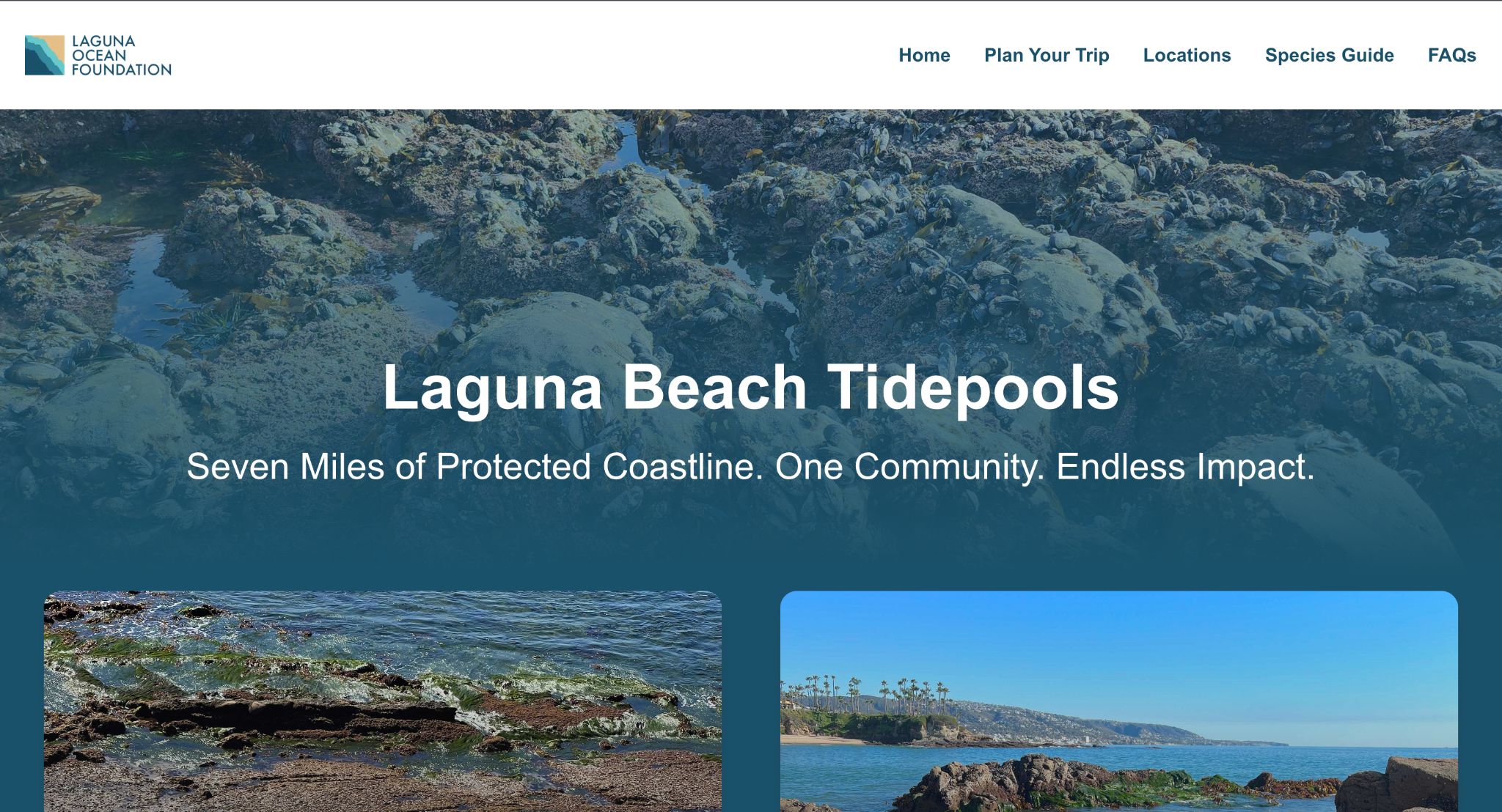
09 / Final Outcome
A more cohesive and engaging educational experience
The final redesign delivered a significantly more cohesive and engaging experience for Laguna Ocean Foundation visitors.
Key improvements
- Fully redesigned responsive interface
- Improved navigation flow
- Interactive species guide
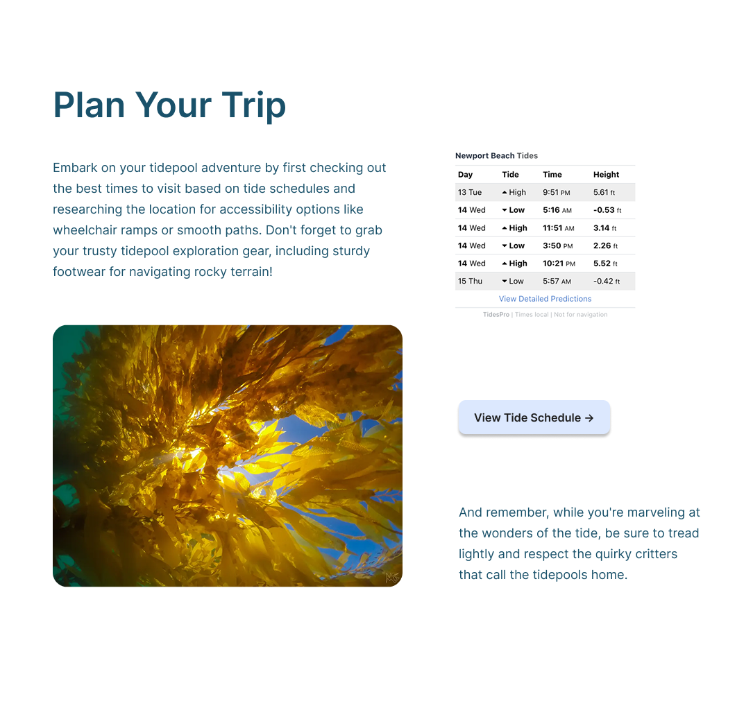
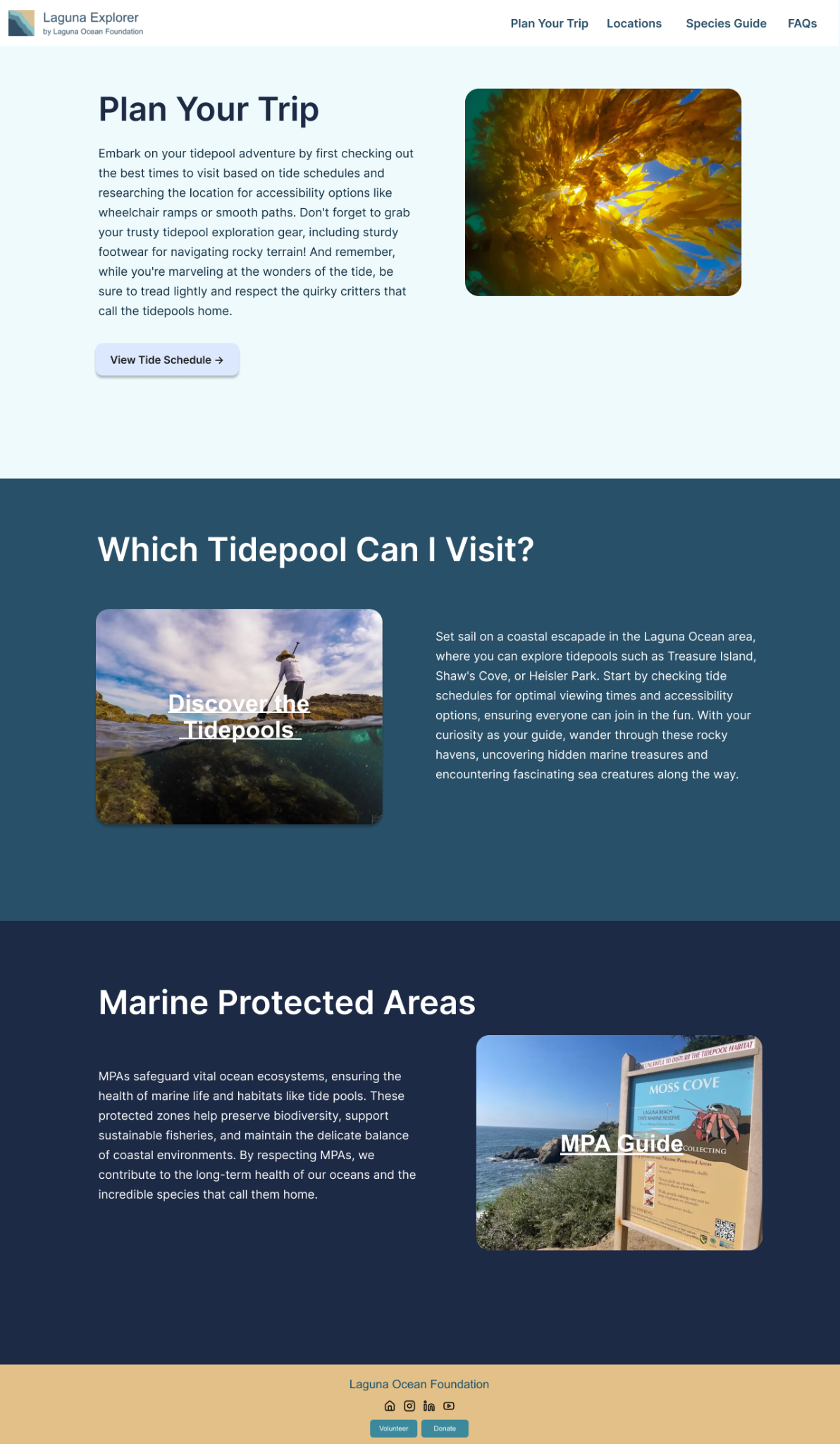
- Embedded live tidepool charts
- Clickable tidepool location system
- Expanded FAQ content
- Improved visual consistency across all pages
The updated platform created a clearer separation between trip planning and species exploration while making educational content easier to discover and interact with.
The redesign also better aligned with the foundation's educational mission by creating a more approachable and visually engaging experience for families, students, and beach visitors.
Most importantly, the project transformed the website from an unfinished informational resource into a more polished educational platform capable of supporting real-world visitor experiences.
10 / Reflection
What I learned
This project taught me how much real-world UX work depends on adaptability, collaboration, and communication, not just visual design.
Working with a live stakeholder meant balancing feedback, technical constraints, shifting priorities, and development timelines simultaneously. It pushed me to think beyond designing screens and instead focus on how users actually move through information in different contexts.
I also gained valuable experience bridging design and frontend implementation. Moving directly from Figma prototypes into React development helped me better understand how design systems, responsiveness, and interaction decisions translate into production environments.
Most importantly, the project reinforced the importance of iteration. Many of our strongest solutions came from revisiting earlier ideas, responding to critique, and refining the experience over time rather than trying to perfect everything immediately.